BLOQS
BLOQS, a co-makerspace in London, recently underwent a rebrand, and I led the design of their new website. The objective was to create a clean, contemporary site that meets the needs of both new and existing BLOQS members. Additionally, the current back end members portal needed an overhaul to streamline the booking process and improve the users experience.
Website UI/UX
Digital Branding
Design Systems

UX Research
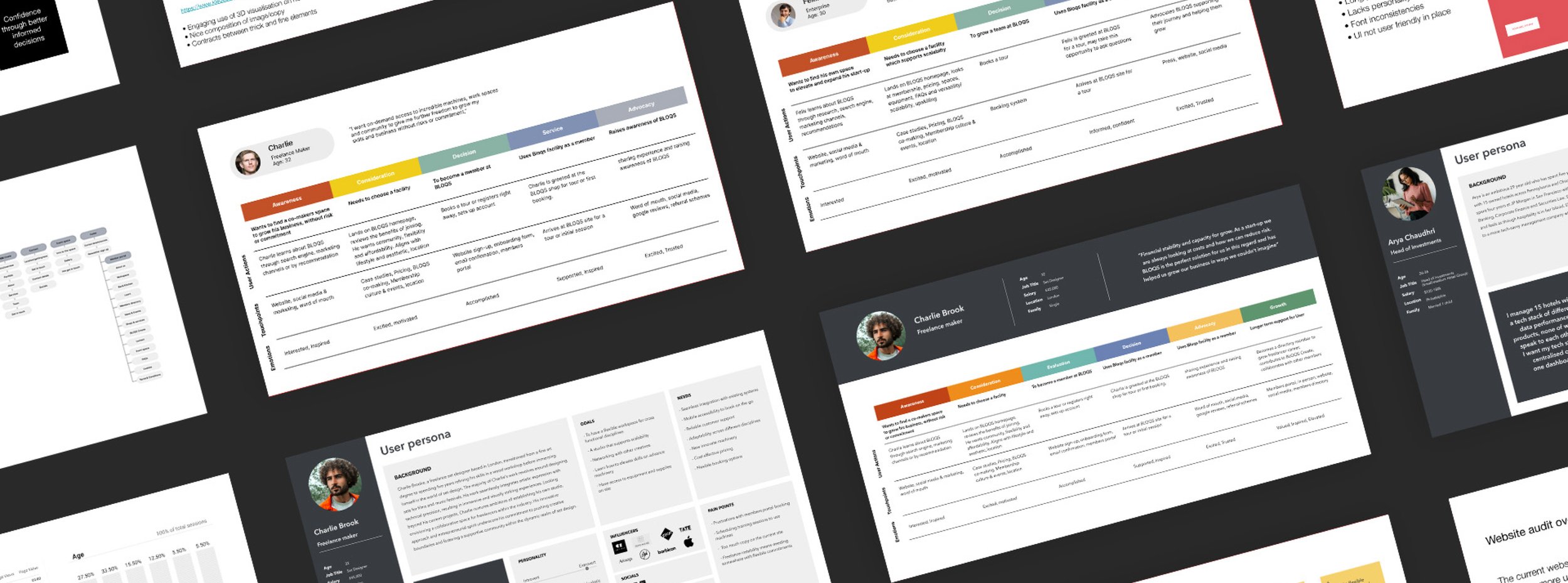
After conducting user interviews with key stakeholders, I gained valuable insights into BLOQS' primary users, including independent freelancers, startups, small-scale companies, and labourers. I then interviewed several BLOQS members to delve deeper into their needs and pain points regarding the current website. These insights were crucial in developing user journeys.
Key findings revealed that users desired a more efficient and quicker process for booking and amending workspace and machinery reservations. They also sought greater flexibility with their memberships. Additionally, users reported difficulties in locating essential information and often felt lost when navigating the website.
UX
When developing the wireframes for BLOQS, simplifying the information architecture was a primary focus. BLOQS offers a variety of workspaces and services, and users often became lost on the website while trying to find information, leading
to drop-offs.
Recognizing that BLOQS' users are creative individuals who prefer visual content, I aimed to strike a balance between providing enough copy for SEO purposes and ensuring that the components were engaging and easy to understand. This approach not only enhanced the user experience but also maintained the website's search engine visibility.
Visual Design
Inspired by BLOQS' organised London site, the new website design reflects this aesthetic with ample white space, structured grids, and crisp lines reminiscent of their creative workspaces.
The design incorporates an architectural feel through its careful spacing and photography. I chose a primary black-and-white colour palette, using the additional brand colours sparingly to accentuate UI elements. The result is a modern, clean, and distinctive identity.
Let’s chat
Ready to bring your vision to life?
Get in touch today to discuss your project.


